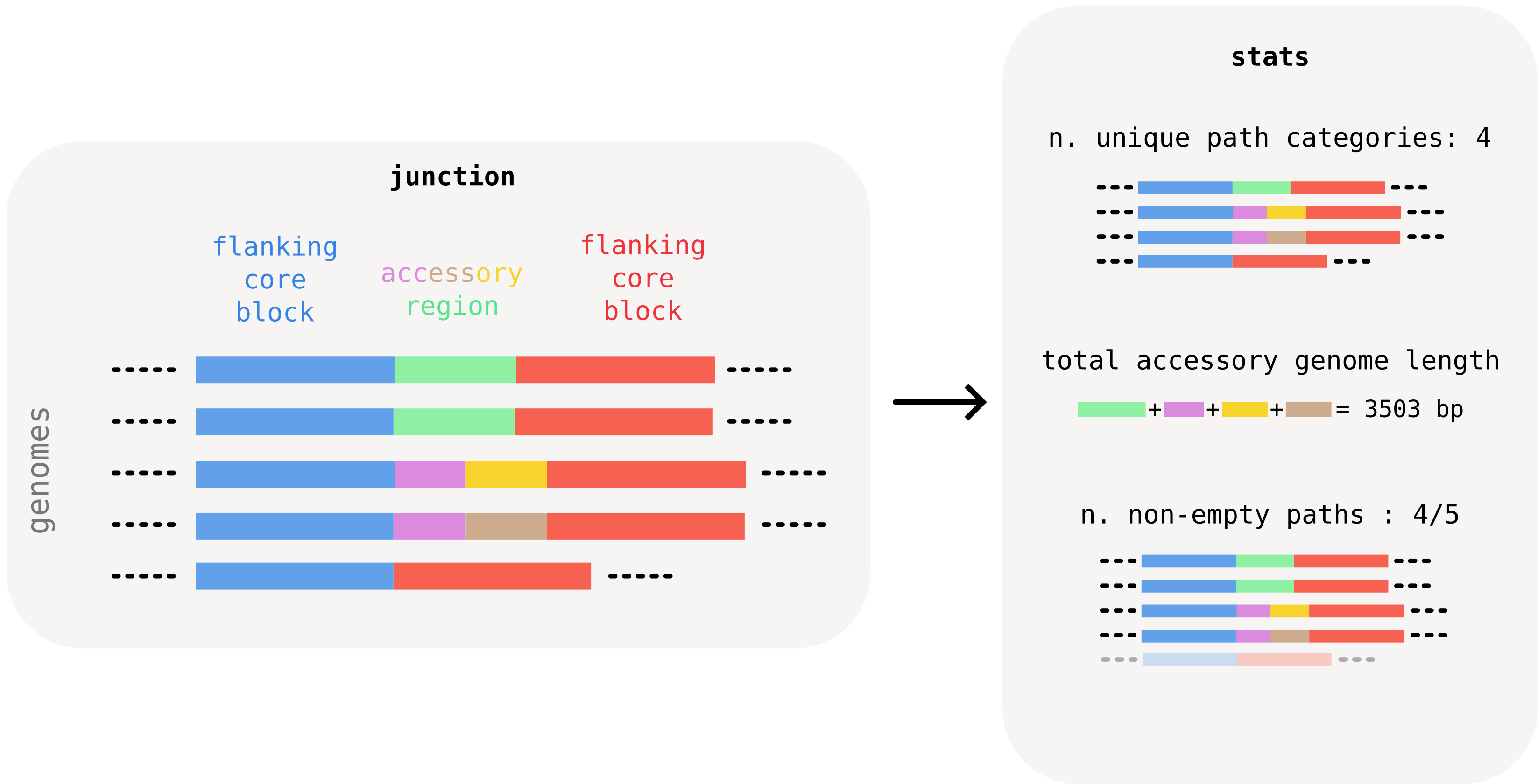
Calculating summary junction statistics
Bacterial genomes can harbor hundreds of loci of accessory genome variability. Manual inspection of every locus is often impractical.
In the course of our work we found it instructive to calculate summary statistics for these regions, to visualize large-scale patterns in the investigated collection. Based on these statistics, one can then pick regions of interest for more detailed inspection.
Useful per-junction summaries include, for example:
- the total number of unique "accessory paths" found within the junction (including the empty one). This is an indication of the structural diversity of the junction. We call this the number of path categories. In the example below, we find 4 categories across 5 paths, since one category appears in two paths.
- the total length of accessory genome found in the junction. This can be calculated by summing the consensus length of all unique accessory blocks found in the junction. In the example below, the junction's total accessory length is roughly 3kb. This number gives an idea of the amount of accessory material that the junction harbors, and can help, for example, to distinguish recent changes associated with particular mobile genetic elements by typical size.
- the number of non-empty paths, i.e. paths that contain at least one accessory block. In the example below, this is every path except for the last one, which only has the flanking core block. Comparing this number to the total number of genomes gives, for example, an indication of whether a junction was caused by a recent insertion. In this case the number of non-empty (or occupied) paths is expected to be very small compared to the dataset size. A recent deletion would conversely show up as a junction where the number of empty paths is very small.
Computing junction statistics with pypangraph
Pypangraph provides a convenient way to quickly calculate summary statistics for all junctions. The BackboneJunctions.stats() method returns a pandas.DataFrame with one row per junction identified by the core edge:
import pypangraph as pp

graph = pp.Pangraph.from_json("staph.json.gz")
junctions = pp.junctions.BackboneJunctions(graph, L_thr=500)

stats = junctions.stats()
print(stats)
#                                                 n_isolates  n_non_empty  n_categories  accessory_length  ...
# edge
# 13733442150340492168_f__17042526223432838337_f          15           15             8              5773  ...
# 12427448985183016017_f__13733442150340492168_f          15            1             2              1512  ...
# 11809679528571820295_r__14906387308163561070_r          15           14             2              1242  ...
The dataframe carries nine columns (see the dropdown below for the full reference), but the three most important ones are those described above:
n_categories: number of distinct accessory paths observed at the junction.accessory_length: total unique accessory content (bp) summed across all distinct accessory blocks ever seen at the junction.n_non_empty: out of the isolates that share the edge, how many actually carry accessory content between the two flanking core blocks (the rest have the two backbone blocks sitting directly adjacent).
In addition to this, the n_isolates column indicates in how many isolates the junction was found. Cases where this number is smaller than the total number of genomes typically indicate synteny changes in some. This is discussed further in the "transitive junctions" dropdown below.
full column reference
n_isolates: number of isolates that have this junction. Whenn_isolatesequals the total number of isolates in the graph, the junction is universal: the flanking backbone blocks appear consecutively in all genomes. Non-universal junctions are typically a sign of synteny breaks.n_non_empty: number of isolates where the junction is non-empty (carries at least one accessory block). The complement,n_isolates - n_non_empty, is the count of isolates where the two flanking backbone blocks sit directly adjacent with no accessory content in between.n_categories: number of distinct accessory path variants. A "category" is a unique sequence of accessory block IDs. All isolates with no accessory blocks (empty center) count as one category.n_majority_category: number of isolates in the most common variant. Together withn_categories, this tells you how diverse the junction is.is_transitive:Trueifn_categories == 1, i.e. all isolates sharing this edge have the same accessory structure (including all-empty).is_singleton:Trueif exactly one isolate has a different variant from all others (n_isolates > 1andn_majority_category == n_isolates - 1).left_core_length/right_core_length: consensus length (bp) of the left and right flanking backbone blocks.accessory_length: total unique accessory content, the sum of consensus lengths of all distinct accessory block IDs appearing in any isolate's center path for this edge. Each block is counted once even if it appears in multiple isolates.
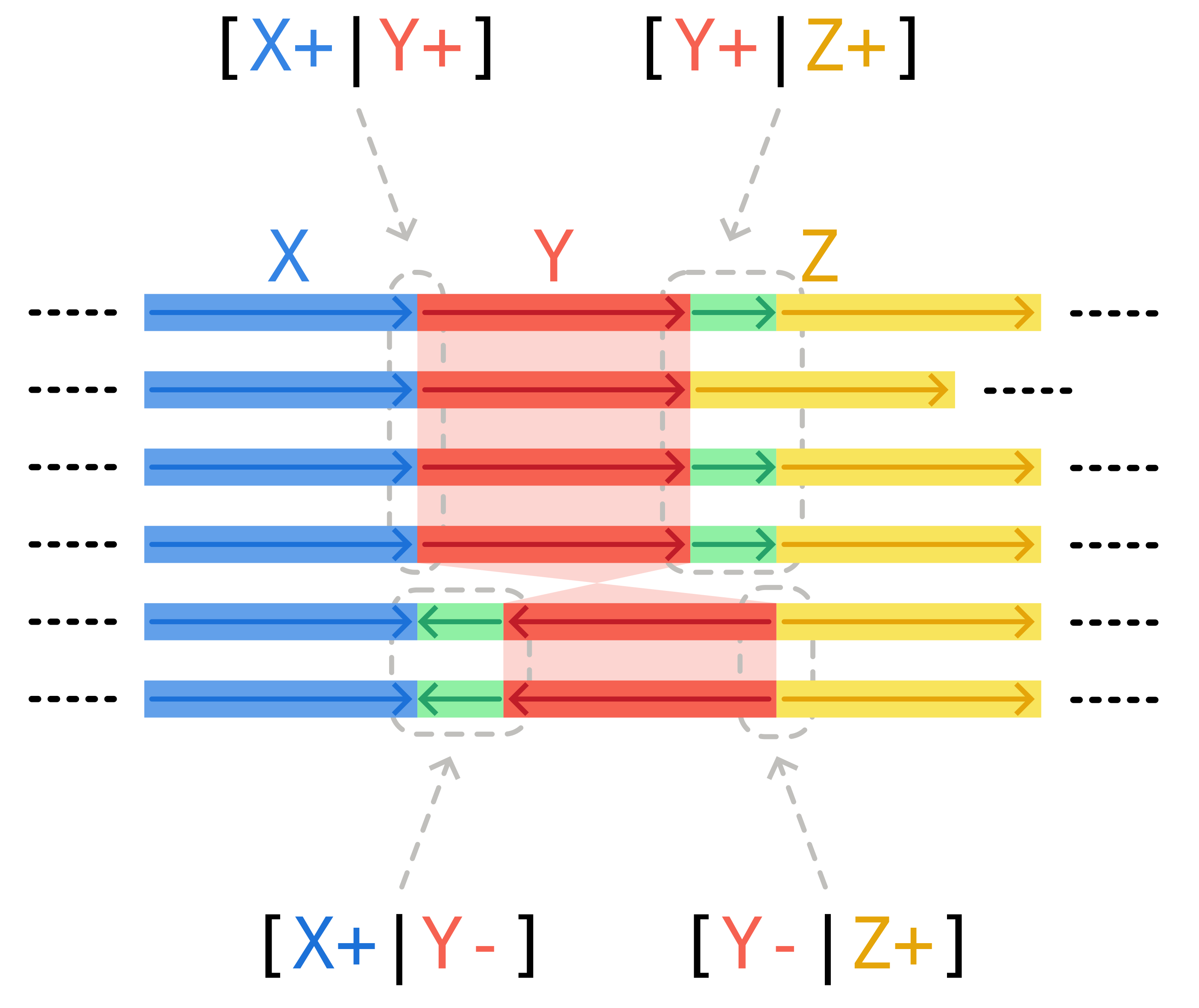
transitive junctions
You might have noticed in the plot above that some junctions have n_categories == 1, i.e. we find only one unique accessory structure (sometimes empty) between the two flanking core blocks. We call these transitive junctions.
How can a junction be transitive? This often happens in one of two ways.
One option is the presence of fixed paralogs in the dataset. Pangraph can detect the homology of the paralogs and identify them as repeated accessory blocks. All orthologous copies of the paralog might appear in the same conserved core context, and as such in a "transitive" junction, which does not represent a locus of recent accessory variation.
A second possibility are synteny breaks. Changes in the order or orientation of core blocks generate edges that are present in only a subset of isolates, even if the flanking core blocks are present in every isolate.
In the scheme below, the inversion of core block Y generates two possible patterns: either genomes possess edges [X+|Y+] and [Y+|Z+], or they have [X+|Y-] and [Y-|Z+]. All of these junctions, with the exception of [Y+|Z+], are transitive. They are generated by the changes in synteny, and not by recent accessory genome variation between the flanking core blocks.
Visualizing the junction landscape
A simple way to visualize the distribution of the three interesting quantities described above at a glance is a strip plot:
import seaborn as sns
import matplotlib.pyplot as plt

fig, ax = plt.subplots(figsize=(7, 4.5))
sns.stripplot(
    data=stats,
    x="accessory_length",
    y="n_categories",
    orient="y",
    jitter=0.25,
    alpha=0.8,
    hue="n_non_empty",
    palette="coolwarm",
    log_scale=(True, False),
    ax=ax,
)
ax.set_xlabel("Accessory length (bp)")
ax.set_ylabel("Number of path categories")
ax.invert_yaxis()
ax.legend(title="n. non-empty", loc="upper left")
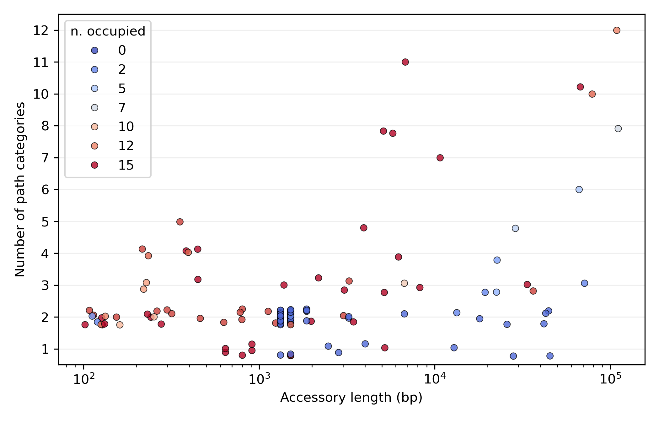
Reading the plot:
- most variation is in junctions with a low number of categories (typically around 2), the loci of limited structural variation.
- amongst these, we find bands of several junctions with characteristic lengths around 1500 and 1300 bp. These are junctions with very few occupied genomes (blue dots), consistent with recent and repeated activity of mobile elements such as Insertion Sequences.
- At the other end of the spectrum, in the top-right corner of the plot, we find hotspots. These are regions with high variability (almost every genome has a unique accessory pattern) and a vast accessory repertoire (around 100kb of unique accessory genome across 15 isolates).
Selecting and visualizing a junction
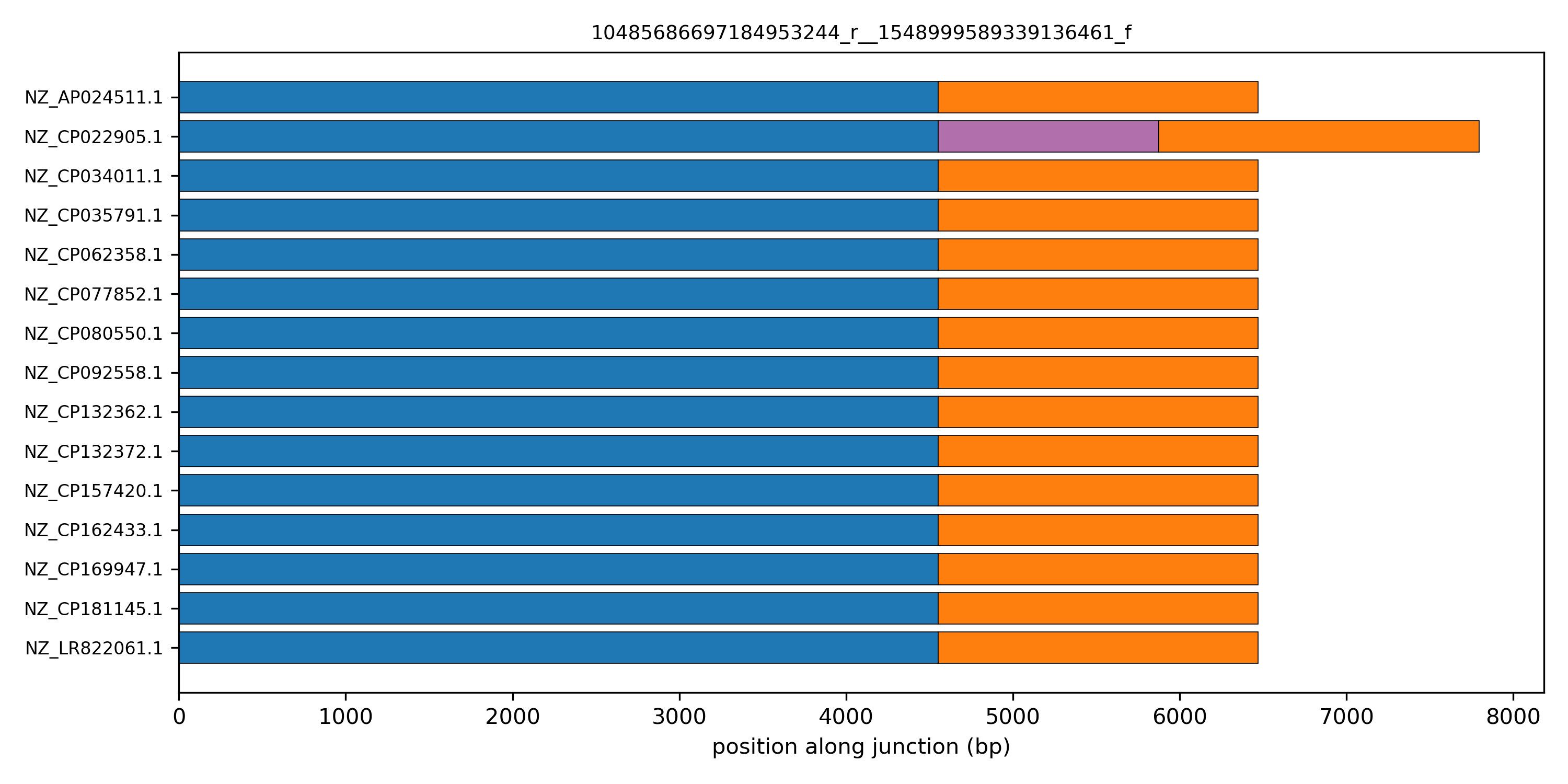
With the stats dataframe in hand, we can easily pick a junction of interest. For example, let's select one of the 2-category junctions with length ~1300 bp:
stats.query("n_categories == 2 and 1200 < accessory_length < 1400")

#                                                 n_isolates  n_non_empty  n_categories  accessory_length  ...
# edge
# 11809679528571820295_r__14906387308163561070_r          15           14             2              1242  ...
# 13894307413921282410_r__14205544068867539089_f          15            1             2              1324  ...
# 10486523597117694808_f__6531151666869853507_r           15            1             2              1324  ...
# 4535080423279022649_f__4857718550591370421_r            15            1             2              1324  ...
# 5751814192644177414_r__8949119045531796691_f            15            2             2              1324  ...
...
# 15114786226276103752_r__432022604910877054_r            15            1             2              1324  ...
# 10485686697184953244_r__1548999589339136461_f           15            1             2              1324  ...
# 1532495113773479365_r__1534747068225797391_f            15            1             2              1324  ...
# 1534747068225797391_f__7253571478449116197_r            15            1             2              1324  ...
There are several such junctions, all with a characteristic accessory length of 1324 bp. This is suggestive of the same mobile element being integrated in several locations of the genome.
A linear schematic of the junction makes its structure visible at a glance. The helper pp.plots.linear_junction_plot draws one row per isolate and one horizontal bar per block, with width equal to the block's consensus length. Junctions are co-oriented to the canonical edge direction so the flanking core blocks line up across rows.
edge = "10485686697184953244_r__1548999589339136461_f"

fig, ax = plt.subplots(figsize=(10, 5))
pp.plots.linear_junction_plot(ax, junctions, edge)
ax.set_title(edge, fontsize=9)
plt.tight_layout()
plt.show()
Customizing the linear junction plot
Once the junction decomposition is done, the code to produce this linear representation for a junction is relatively simple. Feel free to modify it and customize it to your needs.
from collections import defaultdict
import matplotlib as mpl
import numpy as np
import pypangraph as pp

# load the graph and create the junctions object
graph = pp.Pangraph.from_json("staph.json.gz")
junctions = pp.junctions.BackboneJunctions(graph, L_thr=500)

# select an edge to plot
edge = "10485686697184953244_r__1548999589339136461_f"

# assign a unique random color to each block
cmap = mpl.colormaps["rainbow"]
colors = defaultdict(lambda: cmap(np.random.rand()))

# consensus length for each block
block_len = graph.to_blockstats_df()["len"].to_dict()

# dictionary isolate -> junction
Js = junctions[edge]

fig, ax = plt.subplots(figsize=(10, 5))

# cycle through each isolate that has the junction
for row, (iso, J) in enumerate(Js.items()):
    J = J.to_canonical() # align junction to canonical orientation
    x = 0
    for ob in J.oriented_blocks():
        # consensus length and color of each block
        length = block_len[str(ob.id)]
        color = colors[str(ob.id)]
        # each block is a horizontal bar
        ax.barh(
            row,
            length,
            left=x,
            height=0.8,
            color=color,
            edgecolor="k",
            linewidth=0.4,
        )
        x += length

isolates = list(Js.keys())
ax.set_yticks(range(len(isolates)))
ax.set_yticklabels(isolates, fontsize=8)
ax.set_xlabel("position along junction (bp)")
plt.tight_layout()
plt.show()
Displaying more complex junctions
What happens if we explore the pattern of more complex junctions? Try to select junctions that have a large number of unique path categories and visualize their linear structure. Here is an example for core-edge 13256234721607664913_r__7427484406751306657_f.
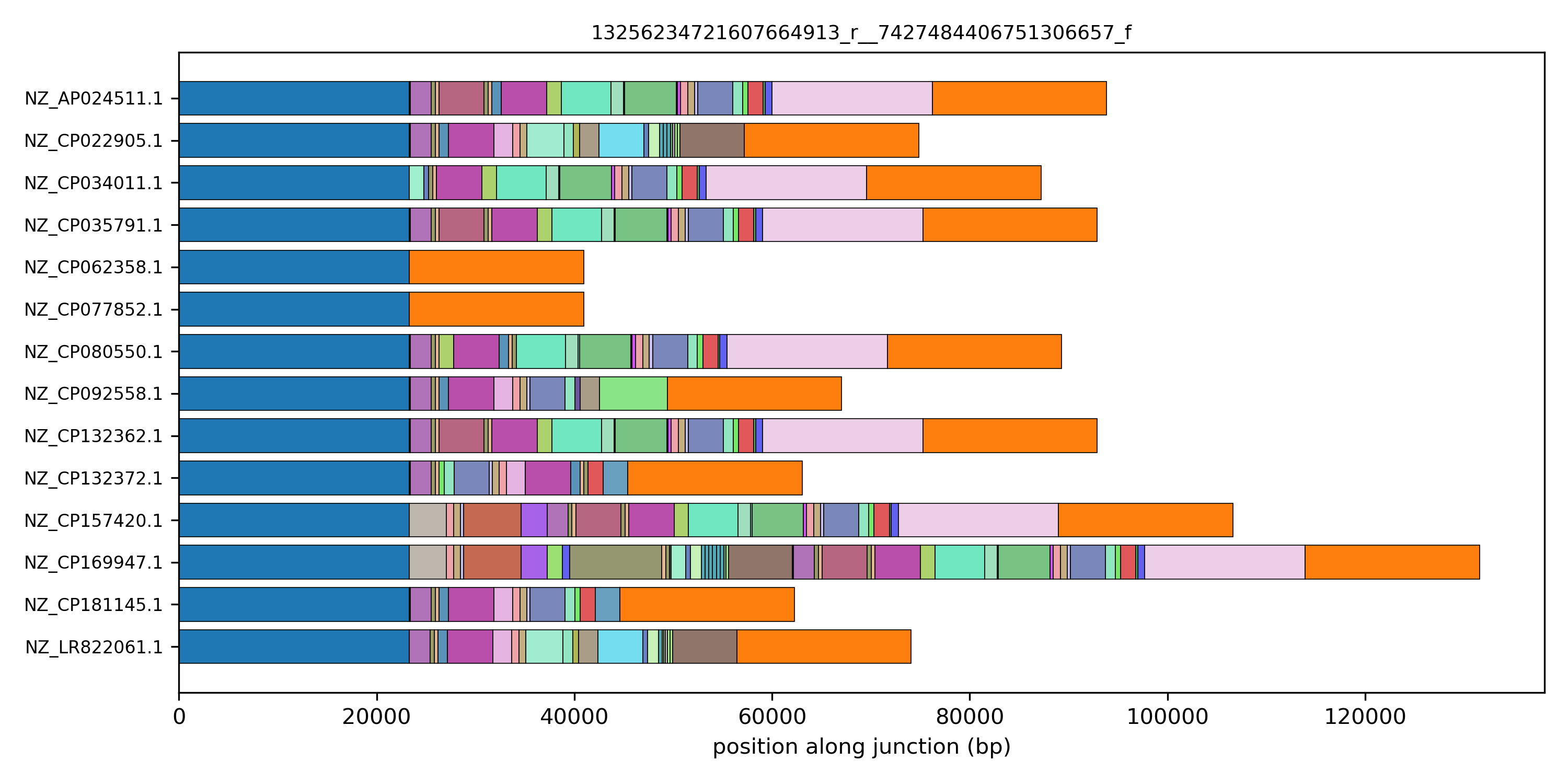
This pattern is suggestive of an element being integrated in this specific location in a single genome. But which element? To answer this question it is useful to be able to access the location of these blocks on the genome, to connect it with sequence annotations, and the sequence itself, for specific homology search or further downstream processing. This will be the topic of the next tutorial section.