Paths and core genome synteny
In this tutorial we will learn how to visualize paths in a pangraph and to survey changes in core-genome synteny.
Visualizing paths
As discussed in the introduction, paths are representation of genomes as sequences of blocks. After loading a graph, we can export a simple representation of the graph with the to_path_dictionary method. This method returns a dictionary where each key is the name of a path and the value is a list of tuples. Each tuple contains the block id and the strand of the block in the path.
import pypangraph as pp

graph = pp.Pangraph.from_json("plasmids.json")

path_dict = graph.to_path_dictionary()
print(path_dict)
# {
#   'RCS48_p1': [(14710008249239879492, True), (8000128254022432074, True), ... ],
#   'RCS80_p1': [(14710008249239879492, True), (8000128254022432074, True), ... ],
#   ...
# }
Combining this representation with information on block lengths and frequency, we can easily create simple visualizations for the paths. For example we can assign different random colors to core blocks and color all non-core blocks in gray.
import matplotlib.pyplot as plt
import matplotlib as mpl
import numpy as np
from collections import defaultdict

block_stats = graph.to_blockstats_df()
# dictionary to assign a new random color to each block
block_color = defaultdict(lambda: plt.cm.rainbow(np.random.rand()))

fig, ax = plt.subplots(figsize=(8, 6))

y = 0
for path_name, path in path_dict.items():
    x = 0
    for block_id, block_strand in path:

        L = block_stats.loc[block_id, "len"] # block consensus length
        is_core = block_stats.loc[block_id, "core"]

        # block color
        color = block_color[block_id] if is_core else "lightgray"
        block_color[block_id] = mpl.colors.to_hex(color)

        height = 0.8 if is_core else 0.6 # block thickness

        ax.barh(y, L, left=x, height=height, color=color)

        x += L
    y += 1

ax.set_yticks(range(len(path_dict)))
ax.set_yticklabels(path_dict.keys())
ax.set_xlabel("length (bp)")
plt.show()
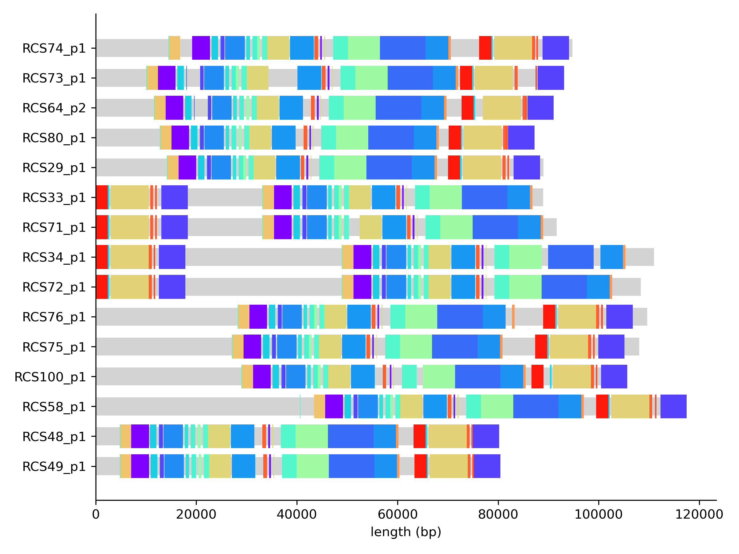
From this plot we observe a strong conservation in the order of core blocks. This is even more explicit if we look at the graph in Bandage. We can use the export function of pangraph to export the graph in GFA format. By adding the --no-duplicated flag and the --minimum-depth 15 option we can make sure that only core blocks are exported.
pangraph export gfa --no-duplicated --minimum-depth 15 plasmids.json -o plasmids_core.gfa
Moreover, we can save the block colors that we used in the previous plot in a csv file, that can be loaded by Bandage to color the blocks. We quote every field (quoting=csv.QUOTE_ALL) so that Bandage matches the long numeric block ids as strings instead of misreading them as numbers.
import csv

pd.Series(block_color, name="Colour").to_csv("block_colors.csv", quoting=csv.QUOTE_ALL)
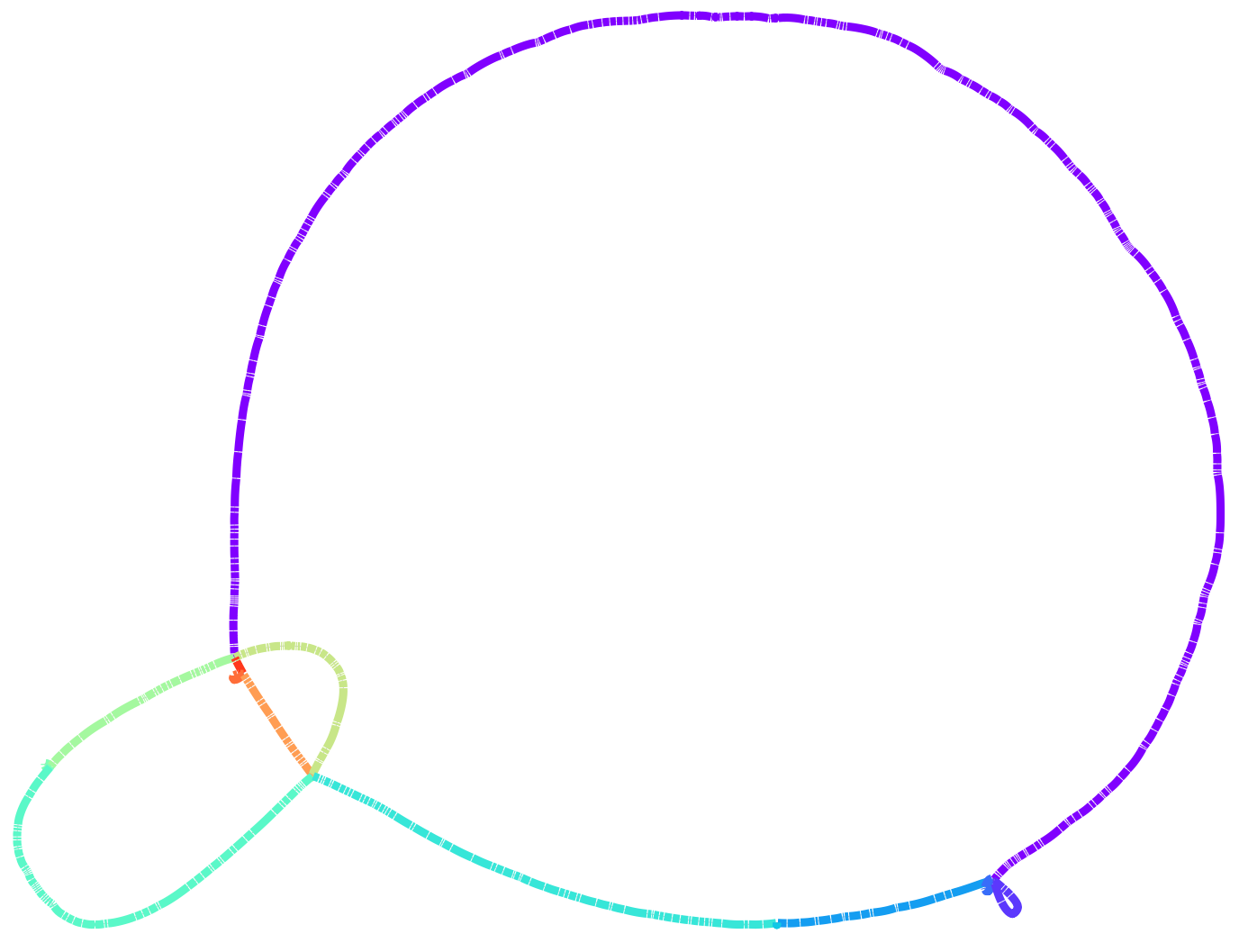
After loading the graph and coloring it we obtain the following picture:
This shows immediately that the order of core blocks is perfectly conserved in our dataset.
Core genome synteny
Plasmids are a relatively simple case to visualize and study, since they are small and have a low number of blocks. For full chromosomal genomes, visualizations can be too complex to be informative.
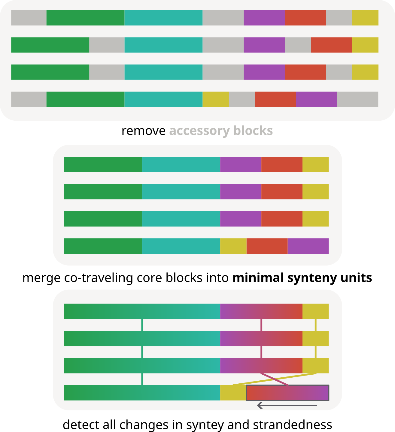
For these cases, pypangraph provides a method to quickly survey all changes in core-genome synteny. This method relies on defining minimal synteny units (MSUs), which are sets of core-blocks that always follow one another in the same order and orientation in all genomes, and if the accessory genome was to be removed they could all be merged together in a single block.
For this part of the tutorial we will analyze the graph.json file created in the first tutorial, containing 10 E. coli chromosomes. The minimal synteny units for this graph can be extracted with the function:
import pypangraph as pp

graph = pp.Pangraph.from_json("graph.json")

# find MSUs
threshold_len = 100  # minimal length of core blocks to consider
MSU_mergers, MSU_paths, MSU_len = pp.minimal_synteny_units(graph, threshold_len)
This returns three objects:
MSU_mergers: a dictionary where keys are core block ids and the values are the ids of the MSU they belong to.MSU_paths: a dictionary where keys are path ids and values arepypangraph.topology_utils.Walkobjects composed of MSUs instead of blocks.MSU_len: a list of the lengths of the MSUs in basepairs, i.e. the sum of consensus length of the core blocks that compose them.
We can draw a linear representation for paths in terms of the MSUs with the following code, in which each MSU is represented as a colored block of unit size. Arrows indicate inversions.
import matplotlib.pyplot as plt
import matplotlib as mpl
from collections import defaultdict

# dictionary to assign colors to MSUs
cmap = mpl.colormaps["rainbow"]
color_generator = (cmap(i / len(MSU_len)) for i in range(len(MSU_len)))
colors = defaultdict(lambda: next(color_generator))

fig, ax = plt.subplots(figsize=(8, 5))

for i, (iso, path) in enumerate(MSU_paths.items()):
    for j, ob in enumerate(path.oriented_blocks):
        ax.barh(i, 1, left=j, color=colors[ob.id])
        if not ob.strand:
            ax.arrow(j + 1, i, -0.8, 0, head_width=0.2, head_length=0.2)
ax.set_yticks(range(len(MSU_paths)))
ax.set_yticklabels(list(MSU_paths.keys()))
plt.show()
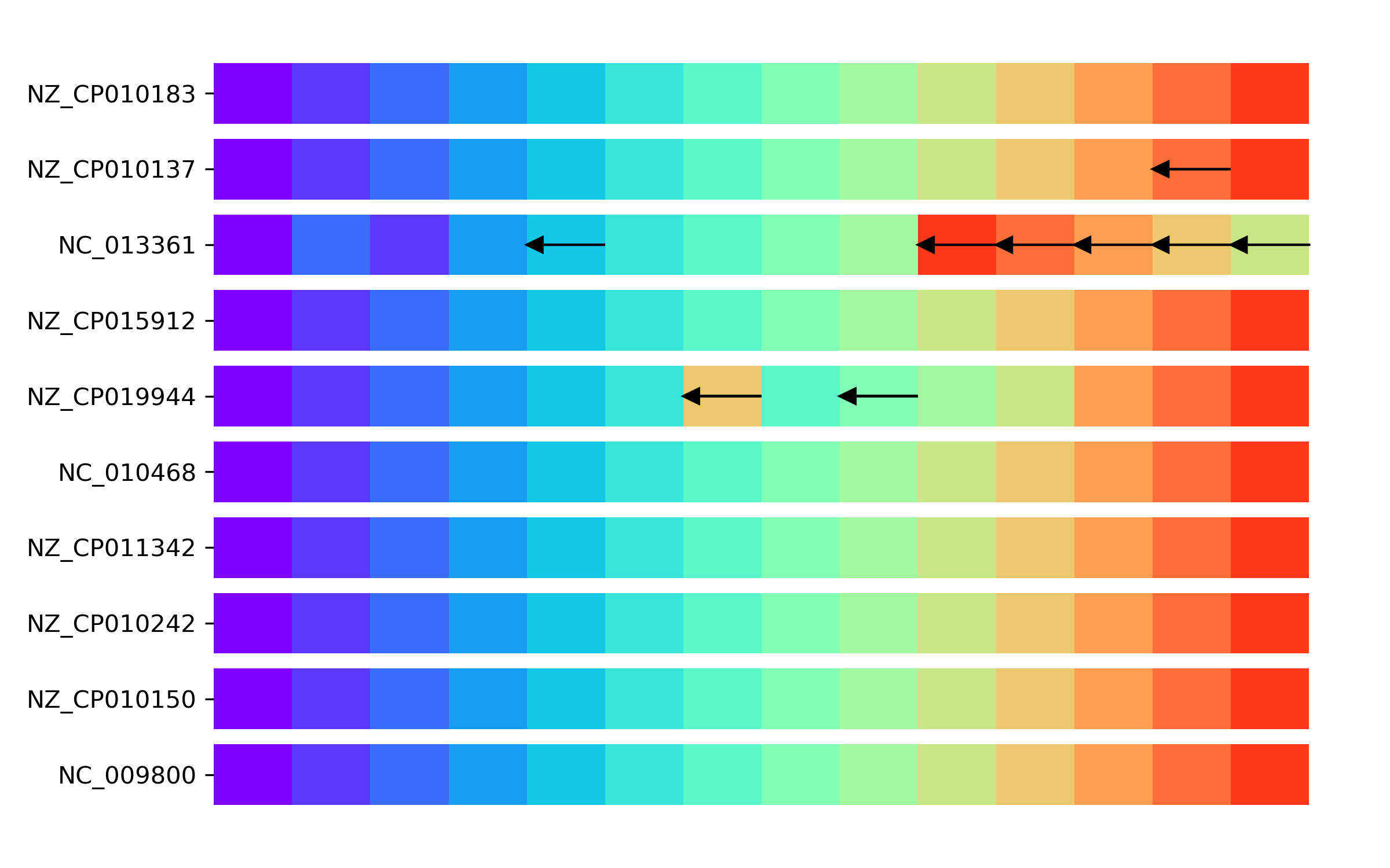
We observe that, while most genomes have a conserved order of MSUs, three genomes present variations. These consist of inversions or translocations of a set of core blocks.
Similarly to what done for plasmids, we can visualize these units on Bandage. We can export the graph in GFA format, only keeping core blocks, with:
pangraph export gfa \
    --no-duplicated \
    --minimum-depth 10 \
    -o ecoli.gfa \
    graph.json
And then we can export the dictionary of core-block colors with:
import csv

block_colors = {}
for block_id in graph.blocks.keys():
    if block_id in MSU_mergers:
        block_colors[block_id] = mpl.colors.to_hex(colors[MSU_mergers[block_id]])
    else:
        block_colors[block_id] = mpl.colors.to_hex("lightgray")
# quote every field so Bandage matches the long numeric block ids as strings
pd.Series(block_colors, name="Colour").to_csv("block_colors.csv", quoting=csv.QUOTE_ALL)
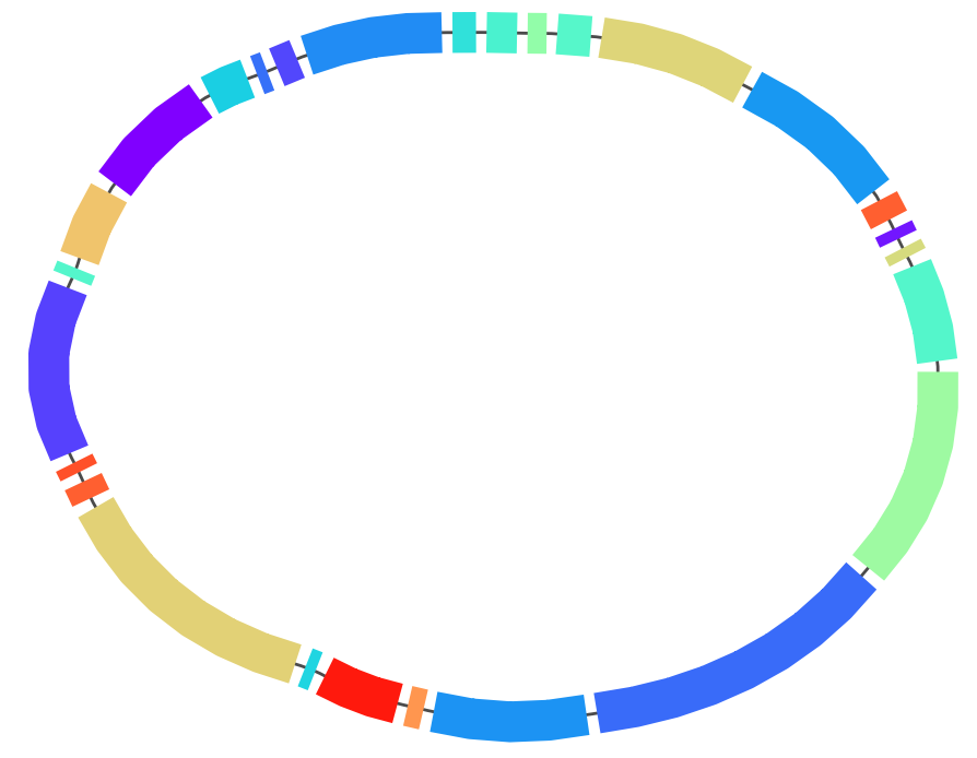
After loading the graph in Bandage and coloring the blocks we obtain the following picture: